Trial Sign-up
Updated Trial Sign-Up Flow for Webgility
My Role
UX/UI Design, Prototyping, User Research
Length
1 month
Team
Head of UX, Lead Product Manager, CEO, Project Managers, Marketing, Engineers, QA team
Introduction
Overview
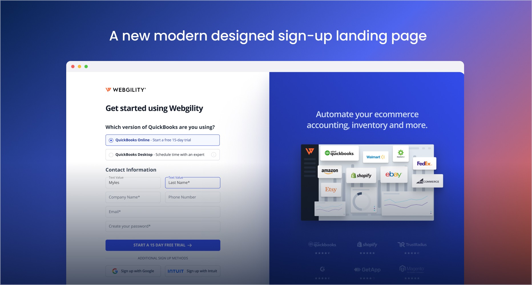
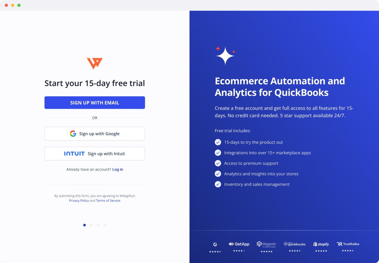
We aimed to redesign Webgility's trial sign-up flow to provide users with multiple ways to create an account and activate their trial. The new design incorporates Google and Intuit sign-up options, brand awareness, value propositions, and social proof to enhance user trust and engagement.
CONTEXT
Time for a new approach.
We aimed to redesign Webgility's trial sign-up flow to provide users with multiple ways to create an account and activate their trial. The new design incorporates Google and Intuit sign-up options, brand awareness, value propositions, and social proof to enhance user trust and engagement.
Problem space
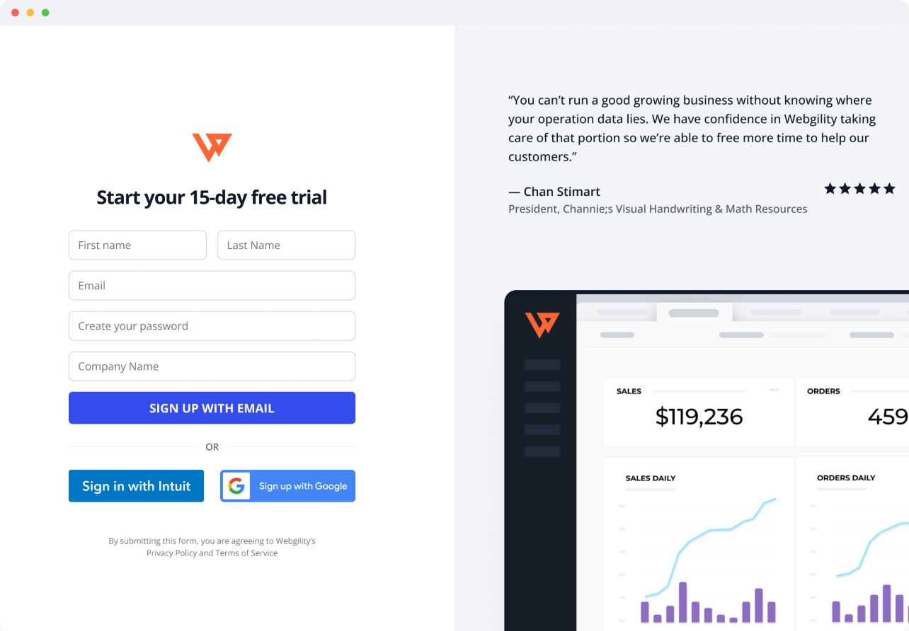
The original trial sign-up flow was outdated and lacked effective branding and a professional tone.
Research was conducted through heuristic evaluations, remote viewing, and through internally tracked metrics. These were the issues that we needed to solve.
Reluctance to Create Accounts
Users preferred sign-up options like Google and Intuit for convenience.
Confusion About Trial Process
Users were unsure about the differences between WO (Cloud product) and WD (QBD) products.
Lack of Guidance
The sign-up flow did not guide users effectively, making the process overwhelming.
Outdated UI
The old UI lacked a modern feel, reducing user trust.
Research and insights
Additional Sign-Up Options: Offering multiple ways to sign up, including Google and Intuit.
Login Option: Providing a login screen for existing users.
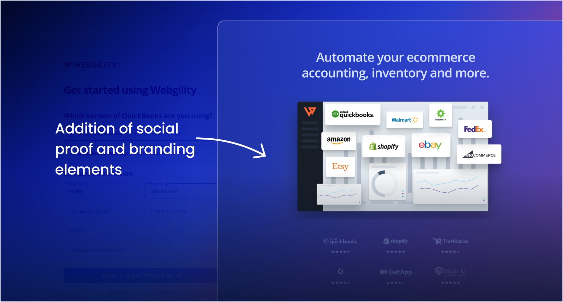
Social Proof: Consistent messaging and branding to build trust.
Modern UI: A modern, intuitive UI that aligns with competitors and other integration software.
User flow
We constructed a user flow to understand the full sign-up process and where we would be able to gather data for the user.
Ability to store data of the user utilizing new CMS capabilities.
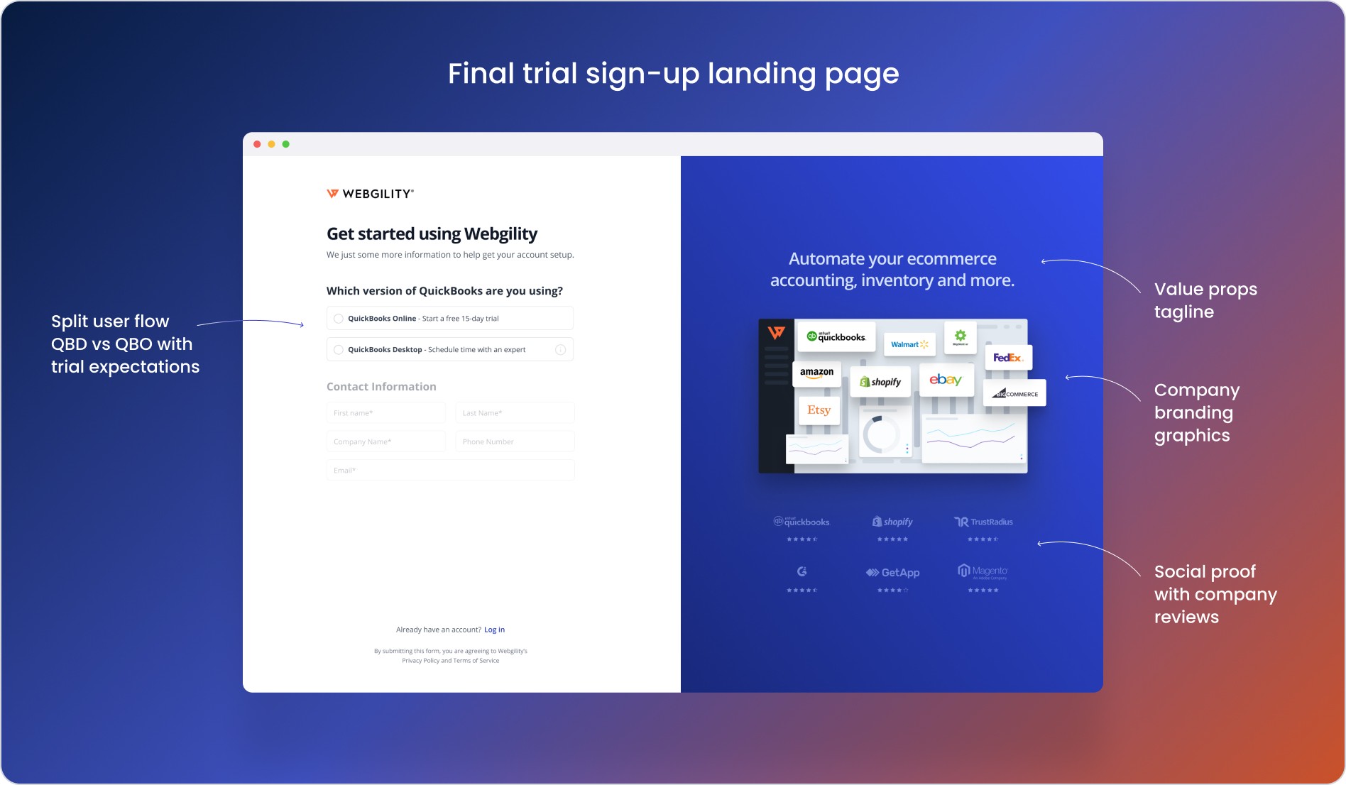
Keep the current split funnel where users pick which accounting system they use.
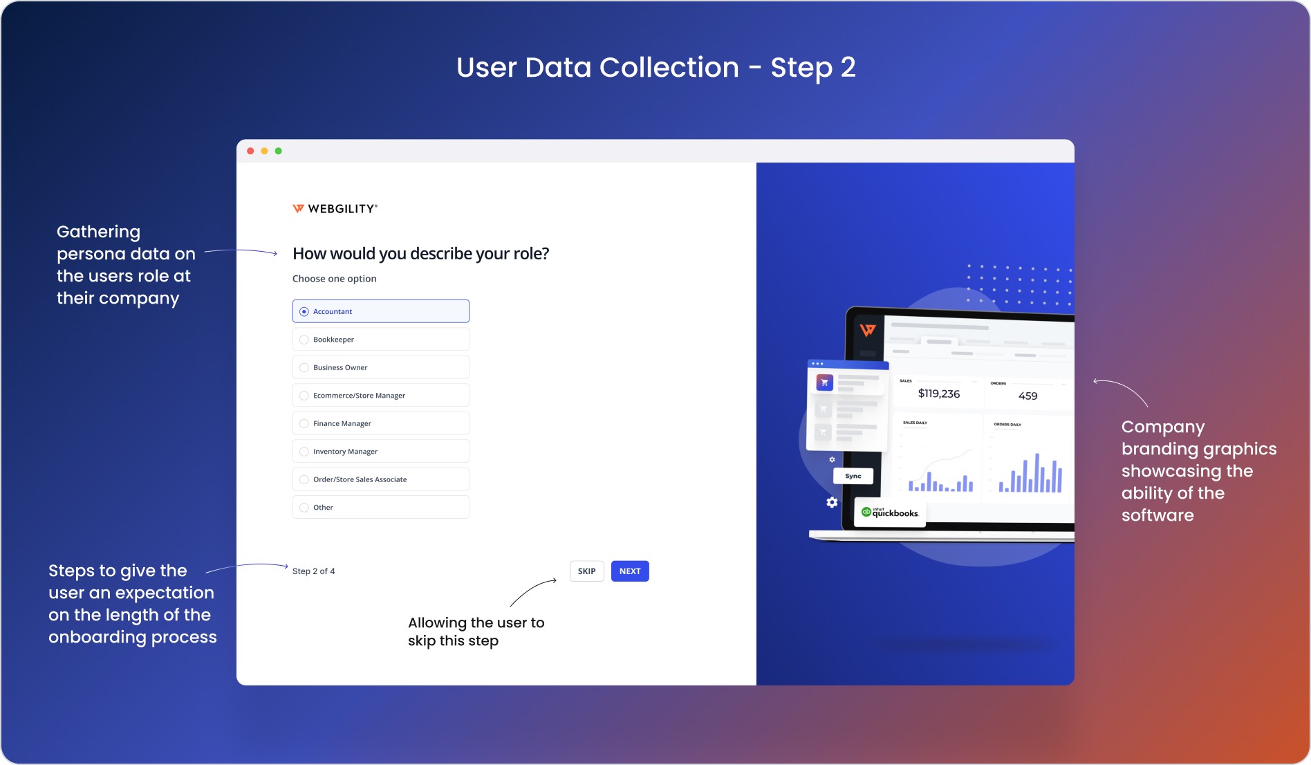
Introduce personal question steps to gather user data and also tailor the experience for them.
Give users the ability to sign-in using google and intuit accounts.
design discovery
A Modernized approach.
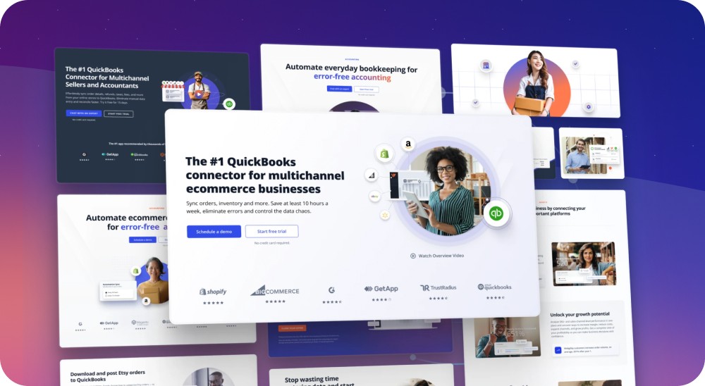
Our first approach to the problem was to ideate through different landing page styles and graphics. We wanted to include a few key factors to this approach:
OAuth Sign-Up: Allow users to sign up through OAuth using Google or Intuit.
Branding and Social Proof: Include branding and social proof in the sign-up flow.
Guidance: Guide users through the sign-up process with clear instructions and expectations.
Trial Expectations: Inform users about what to expect during the trial.
Prototyping
Prototyping for stakeholders
In order to gain stakeholder feedback between all teams I created a prototype showcase the style of the new sign-up flow, structure, and micro-animations we wanted to add into it.
Issues and feedback
Not splitting the funnel now detracted from our scheduled demos, which we found to be a helpful factor in users purchasing a plan.
We did not implement the questionnaire questions and therefore were not able to gather information about our users.
The branding and graphics on the landing page seemed to distract users, this was determined through a heat map.
final designs
Bringing together user and business needs
The final version brought together these key features:
OAuth Sign-Up: Simplified sign-up process allowing users to sign up through Google and Intuit, reducing friction and increasing convenience.
Onboarding Questions: Gathered user data through a series of onboarding questions, helping to build detailed user personas and inform future decisions.
Animations: Enhanced user experience with subtle, engaging micro-animations.
Graphics and Branding: Built trust and brand image with modern graphics and consistent branding throughout the sign-up flow.
Responsive Design: Ensured accessibility across devices, providing a seamless experience for both desktop and mobile users.
Business vs. User Goals: Balanced business needs with user experience, ensuring a smooth and efficient onboarding process.
Results
Improved metrics across the board
Increased Sign-Ups: Sign-ups increased by 30% due to the improved, user-friendly sign-up flow.
Reduced Dropout Rates: Dropout rates decreased by 25% as a result of the streamlined and engaging onboarding process.
Higher Engagement: User engagement metrics showed a 20% increase in interaction with onboarding content.
Higher Conversion Rates: Conversion rates from trial sign-up to paid subscriptions increased by 15%.
Improved User Insights: Collected onboarding data provided valuable insights into user needs and preferences, informing future product development and marketing strategies.
Enhanced Brand Credibility: The modern UI and consistent branding helped improve the overall perception of the company, leading to better customer trust and loyalty.
reflection
Successes
User-Friendly Design: The new design significantly improved user experience and satisfaction.
Increased Engagement: Higher engagement and conversion rates demonstrated the effectiveness of the new onboarding flow.
Valuable Insights: The onboarding questions provided valuable user data, aiding in the development of detailed personas and informed decision-making.
Areas for Improvement
Continuous Iteration: Further iterations could refine the mobile experience and address any remaining pain points.
Enhanced Personalization: Future enhancements could include more personalized onboarding experiences based on user data.

