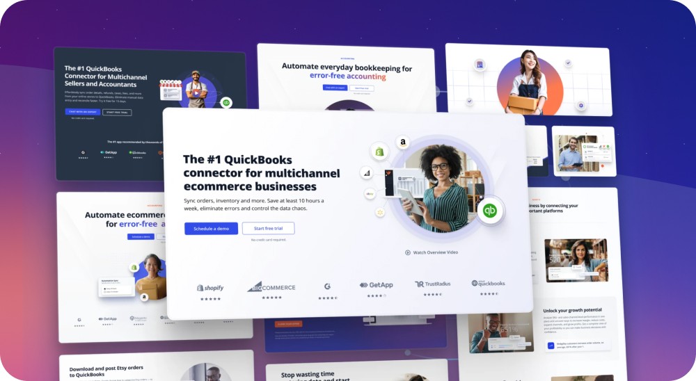
Webgility Online Dashboard
Dashboard and Onboarding Upgrade for the #1 QuickBooks connector for multichannel businesses.


My Role
UX/UI Design, Prototyping, User Research
Length
4 months
Team
Head of UX, Lead Product Manager, CEO, Project Managers, Marketing, Engineers, QA team
Introduction
I was tasked with redesigning the onboarding and dashboard for Webgility Online to meet both business and user needs. This project transformed the dashboard into a hybrid operational tool and made the onboarding process smooth and intuitive for both trial and current users.

CONTEXT
Problem space
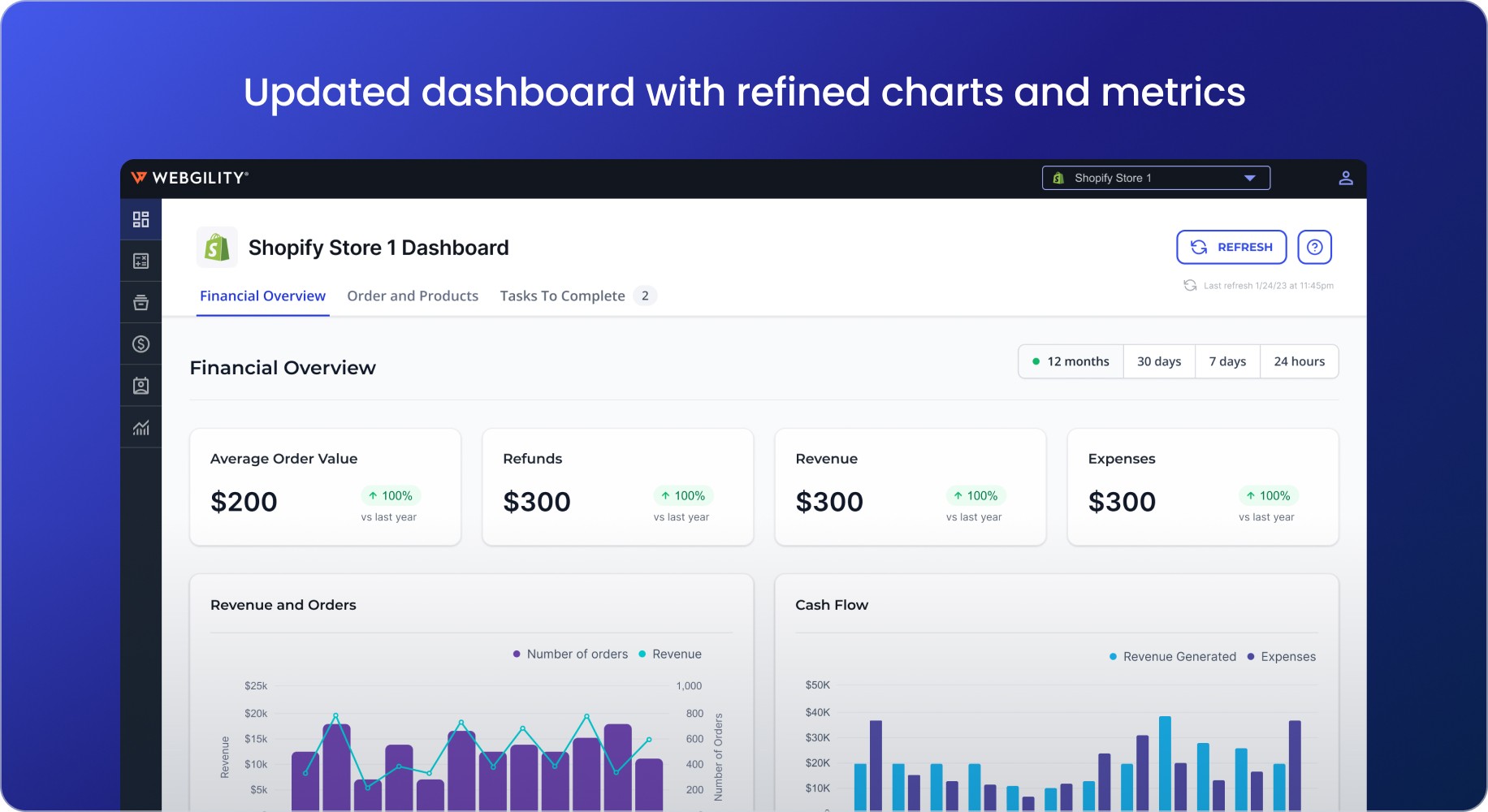
Users often bypassed the dashboard due to its disjointed and confusing layout, missing critical information and insights.
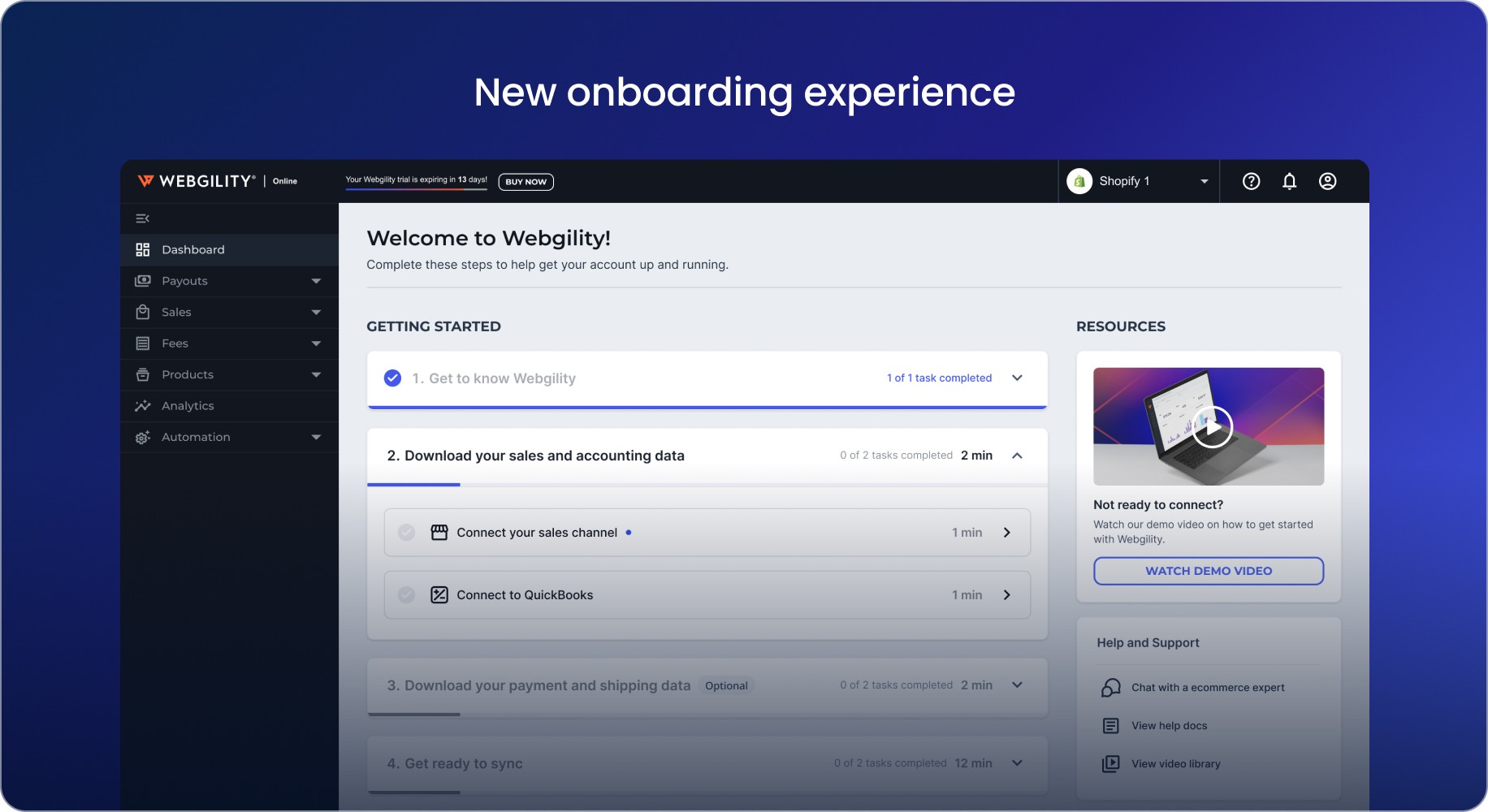
The onboarding process was a tangled mess and lacked clear guidance, further adding to user frustration.
Additionally, the outdated technology resulted in poor performance, scalability issues, and hindered the integration of modern features.
research and insights
To gain insights, we used user interviews, user testing, remote viewing with Storylane, analytics review, A/B testing, and competitor analysis. This comprehensive, data-driven approach helped us align business objectives with user needs effectively.
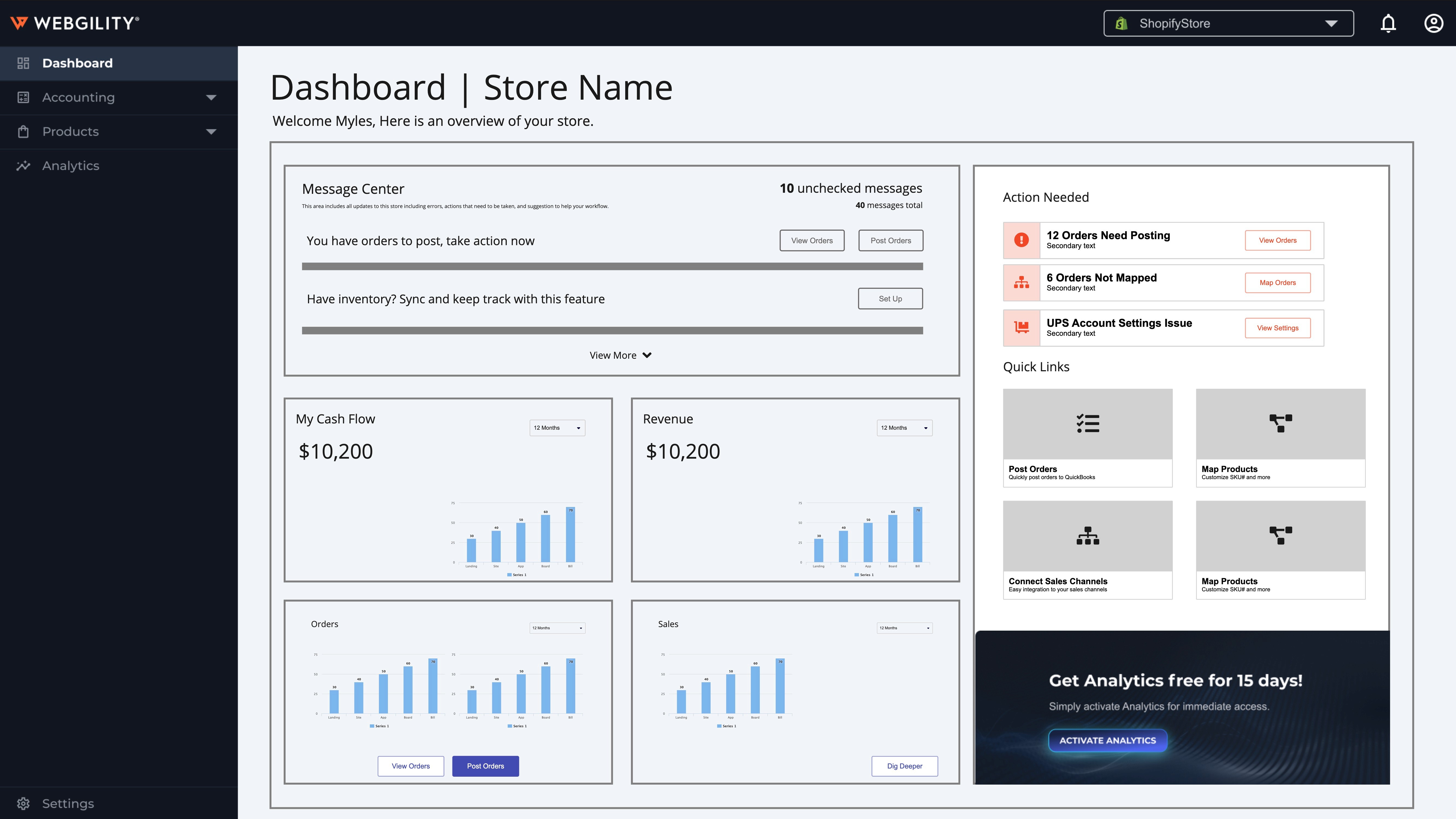
Confusing Charts and Metrics
Charts were hard to understand, lacking supportive text and clear numerical data. Users mainly used Webgility to sync orders with QuickBooks, not for viewing analytics, missing out on potential benefits.
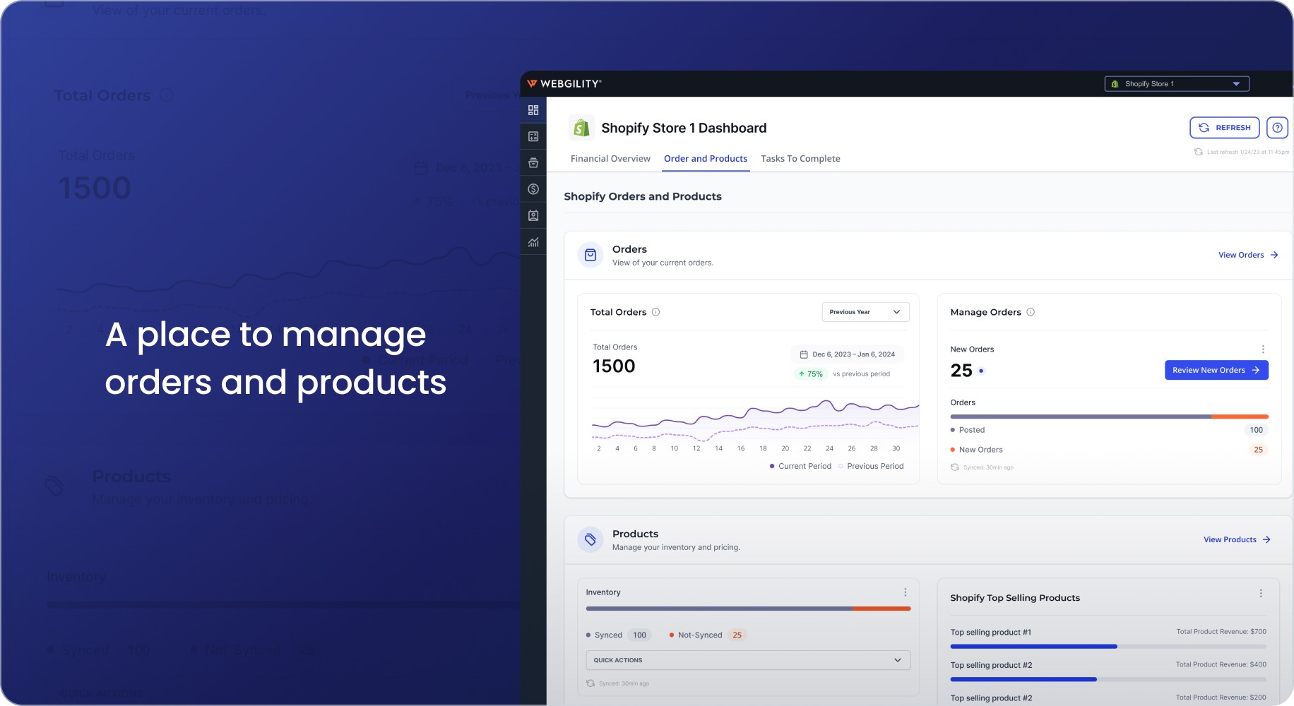
Bypassed Workflows
Users typically bypassed the dashboard, going directly to the orders page to sync and post processes, ignoring valuable business analytics.
Onboarding Roadblocks
The onboarding process forced users to connect a sales channel and their accounting system before exploring the app, creating a barrier.
We conducted a thorough UX audit of the existing dashboard and onboarding flows to identify pain points and areas for improvement.


our approach
Approaching the design direction we knew we needed to keep in mind the user journey for both new trial users and current users. Each journey had to be tailored to the different user needs.
Designing for New Users
Onboarding aimed to get new users onboarded and their account configured as quickly and accurately as possible.
Designing for Current Users
The current users needed a new dashboard that allowed them to use the application more easily.
Design discovery
Design and development
Design Execution
Working closely with the engineering team, we translated our prototypes into high-fidelity designs and implemented them using modern technologies, such as Angular. This collaboration ensured that the final product was both visually appealing and technically robust, providing a scalable and maintainable solution.
Component Design
Final Onboarding Designs

Final Dashboard Designs


results and impact
Improved User Engagement
The redesigned dashboard and onboarding process significantly improved user engagement. Users reported a clearer understanding of the product's value and features, leading to higher activation rates and reduced errors. The intuitive navigation and informative analytics helped users make better use of the dashboard, enhancing their overall experience.
Technical Advancements
Upgrading to Angular allowed us to overcome the limitations of the legacy Asp.Net framework, resulting in improved performance, scalability, and the ability to integrate modern features. This technical advancement ensured that the new dashboard could meet the evolving needs of our users and the market.
Reflections
The redesign of the Webgility Online Dashboard and onboarding process successfully addressed the key pain points identified through user research. By creating a more intuitive and engaging experience, we enhanced user engagement, increased activation rates, and built greater trust in the platform. The transition to modern technologies also positioned us for future growth and innovation, ensuring that Webgility Online remains a leader in ecommerce accounting automation.